MENA Capital had regulatory approval and a trading engine, but nothing for clients to touch. I owned product design end-to-end: defining user flows, building the design system, and shipping every screen from KYC onboarding to live portfolio management.
Context
MENA Capital had the regulatory approval and a backend trading engine, but no client-facing product. I joined as the sole designer reporting directly to the founder. No design team, no PM, no existing patterns. Every product decision, from user flows and information architecture to component API and interaction patterns, was mine to define.
Discovery
I used Claude as a research co-pilot to rapidly analyse competing platforms like Interactive Brokers, eToro, Saxo Bank, and regional players. Four friction patterns stood out across every platform I studied:
Every data point dumped on screen at once. New investors overwhelmed.
Users can't tell what's about to happen. Reversibility unclear.
KYC feels punitive. No feedback, no progress, no reassurance.
Clean design and clear language aren't polish. They're table stakes.
Process & Ownership
With no PM or design lead, I owned the full product design lifecycle, from scoping sessions with the founder to pixel-level dev handoff.
Weekly syncs to align business goals with UX priorities. Translated regulatory constraints into user-friendly flows.
Mapped every user journey from scratch: onboarding, KYC, deposits, transfers, reporting. No existing patterns to reference.
Sat with engineers to define component specs, token naming, and handoff structure. Design system built for their stack, not just Figma.
Requirements changed weekly. I prototyped fast, tested assumptions, and shipped decisions, not decks.
Design System
I built the design system before designing a single screen. Claude connected directly to Figma via a bridge plugin to organise colour tokens, generate swatch collections, build type scales, and scaffold input field states. AI handled the repetitive token work so I could focus on the decisions that matter.
| Style | Size | Weight | Sample |
|---|---|---|---|
| Display | 48 | Bold | Portfolio |
| Heading 1 | 30 | Semibold | Account Overview |
| Heading 2 | 24 | Semibold | Trade Summary |
| Heading 3 | 20 | Medium | Wallet Balance |
| Body | 14 | Regular | Enter the amount you'd like to deposit into your trading account. |
| Caption | 12 | Regular | Last updated 2 mins ago |
| Mono | 12 | Regular | $12,450.00 USD |
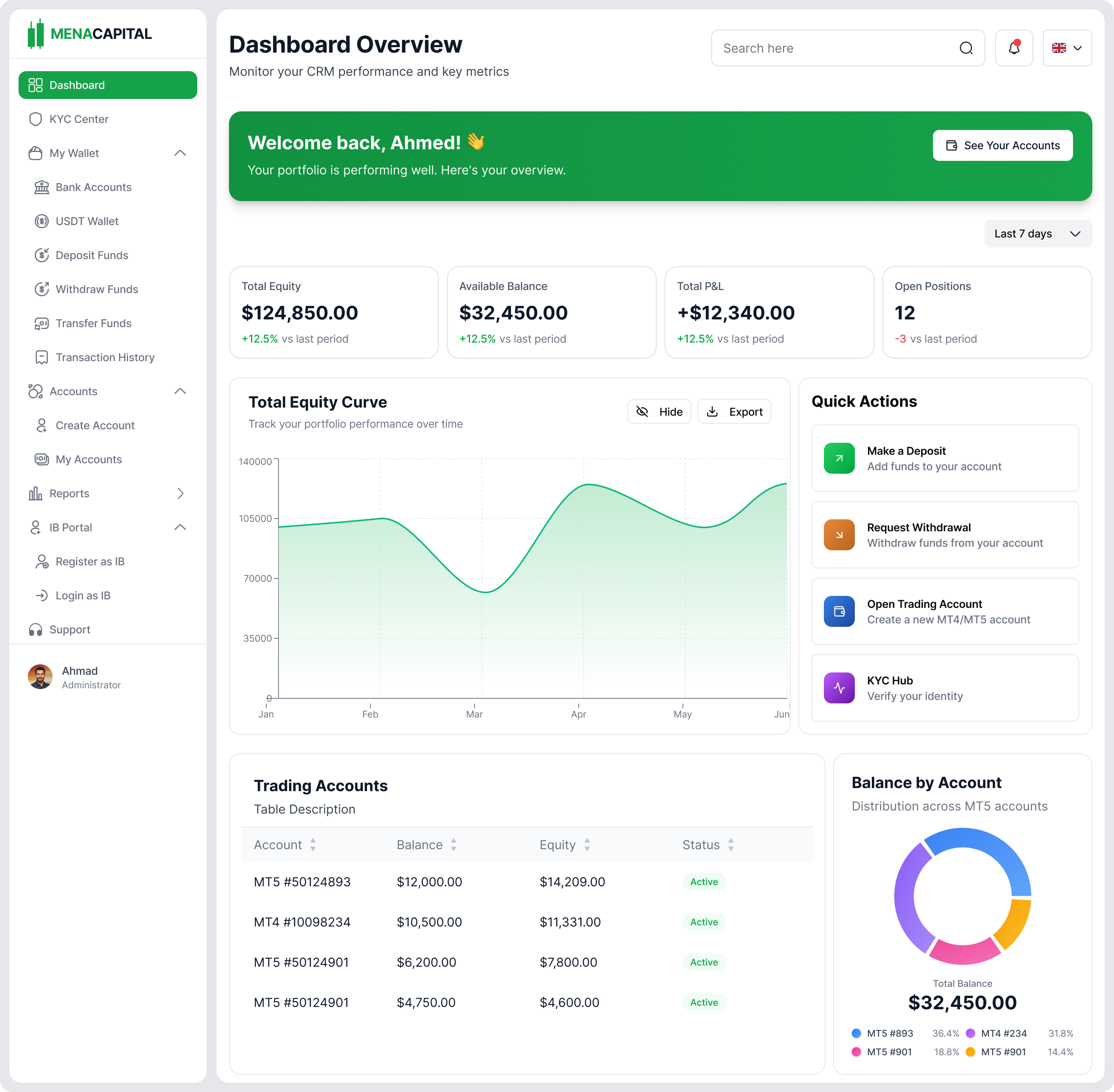
Key Screens
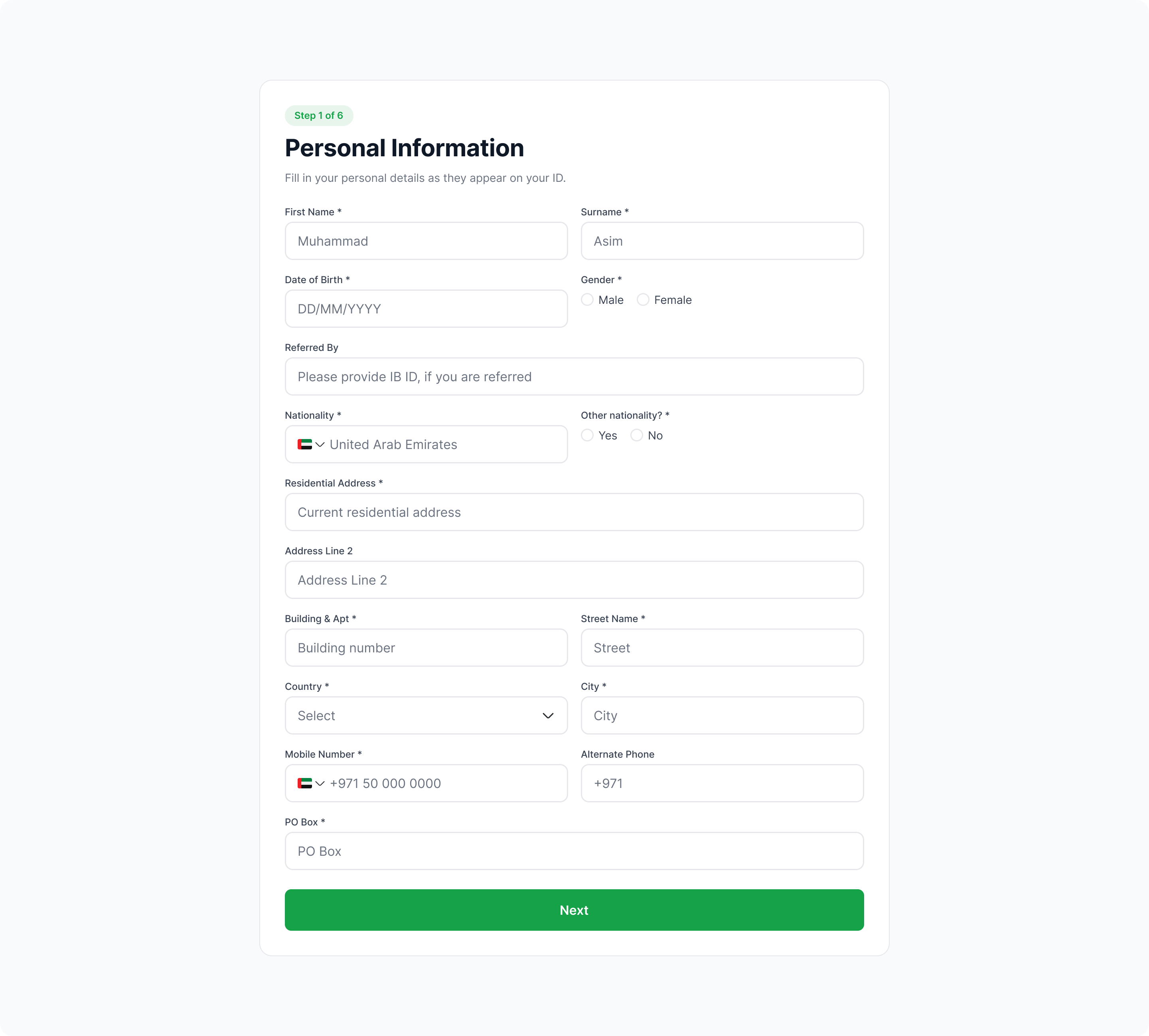
KYC Onboarding: progressive personal information
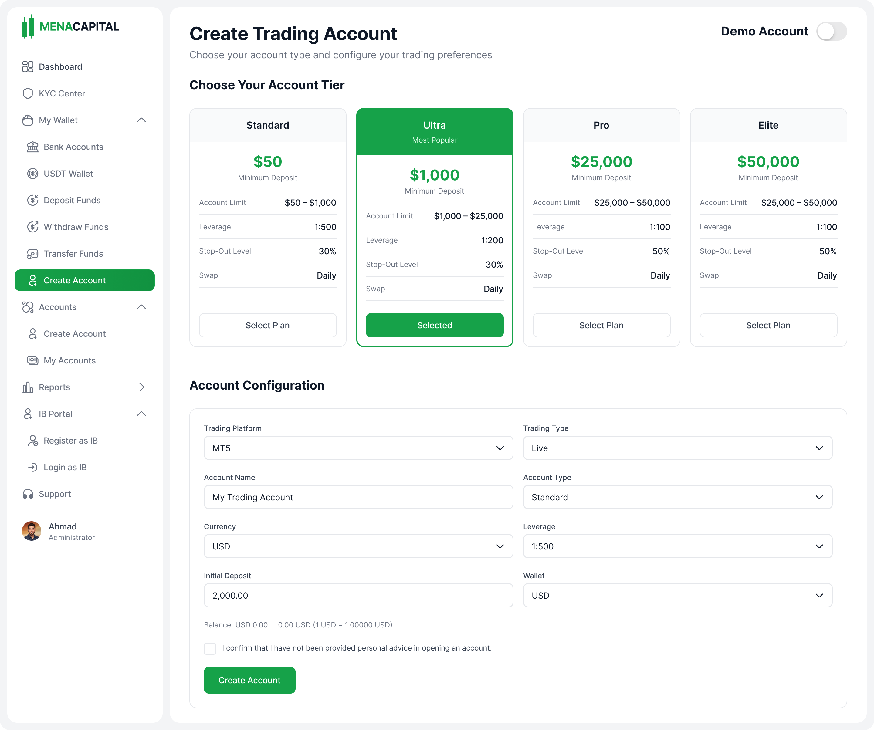
Create Account: tier selection + configuration
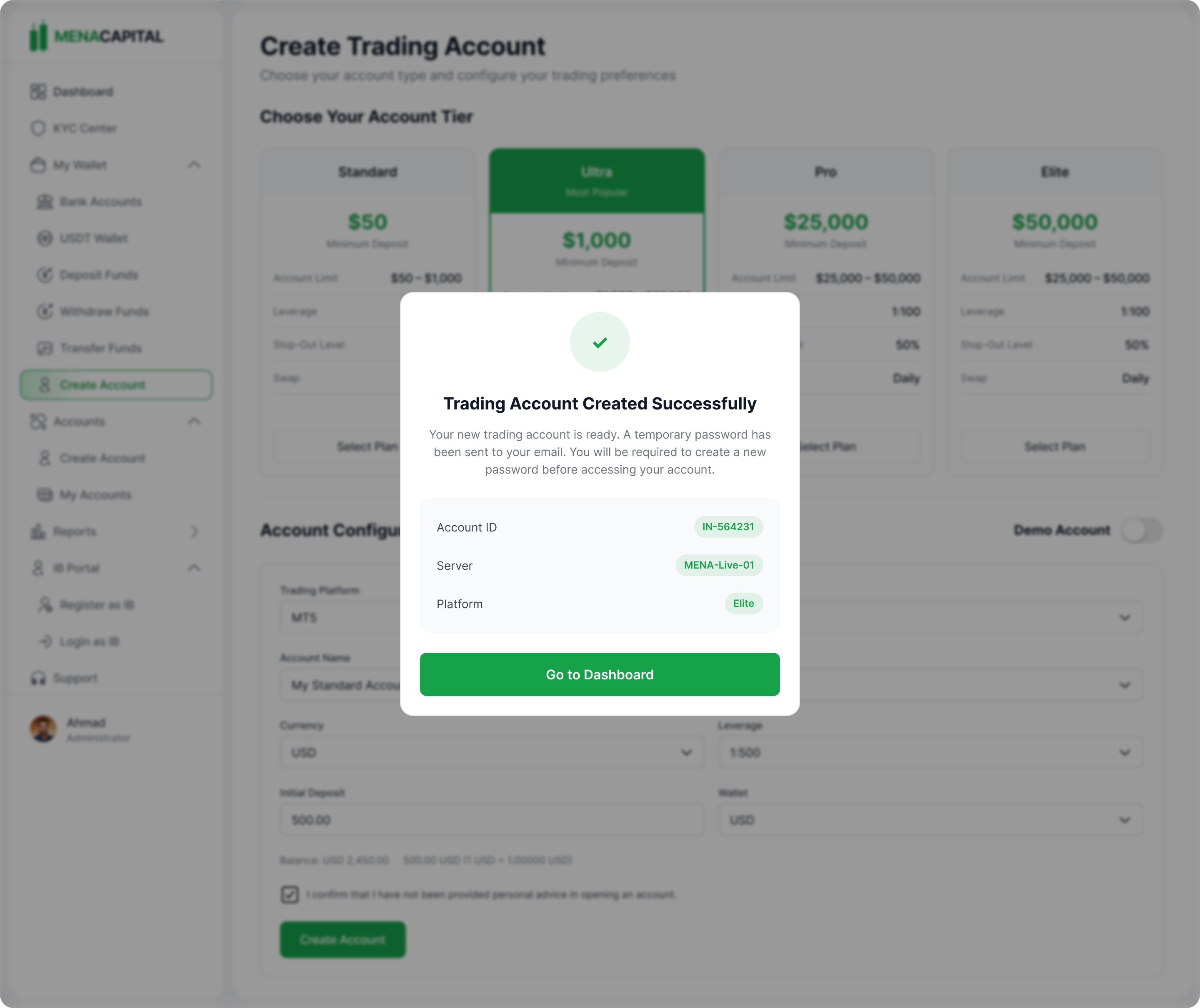
Account Created: success confirmation with next steps
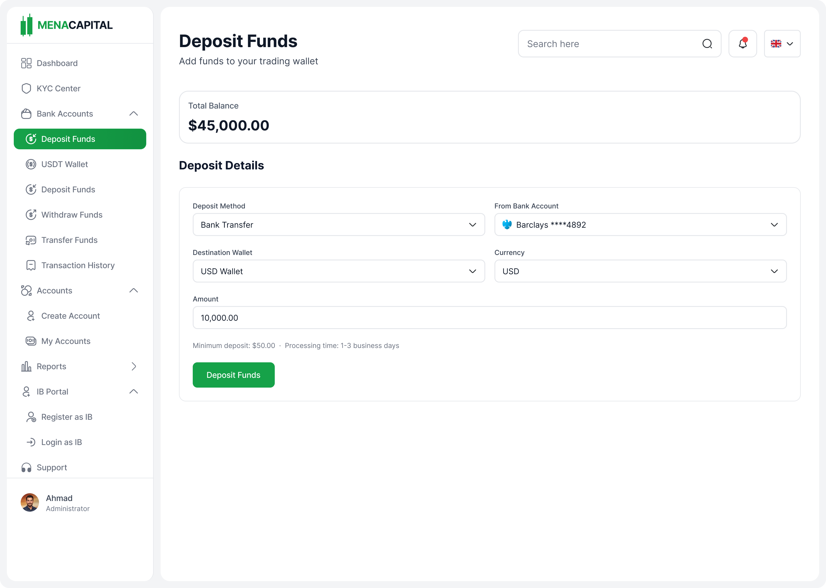
Deposit Funds: bank transfer with balance visibility
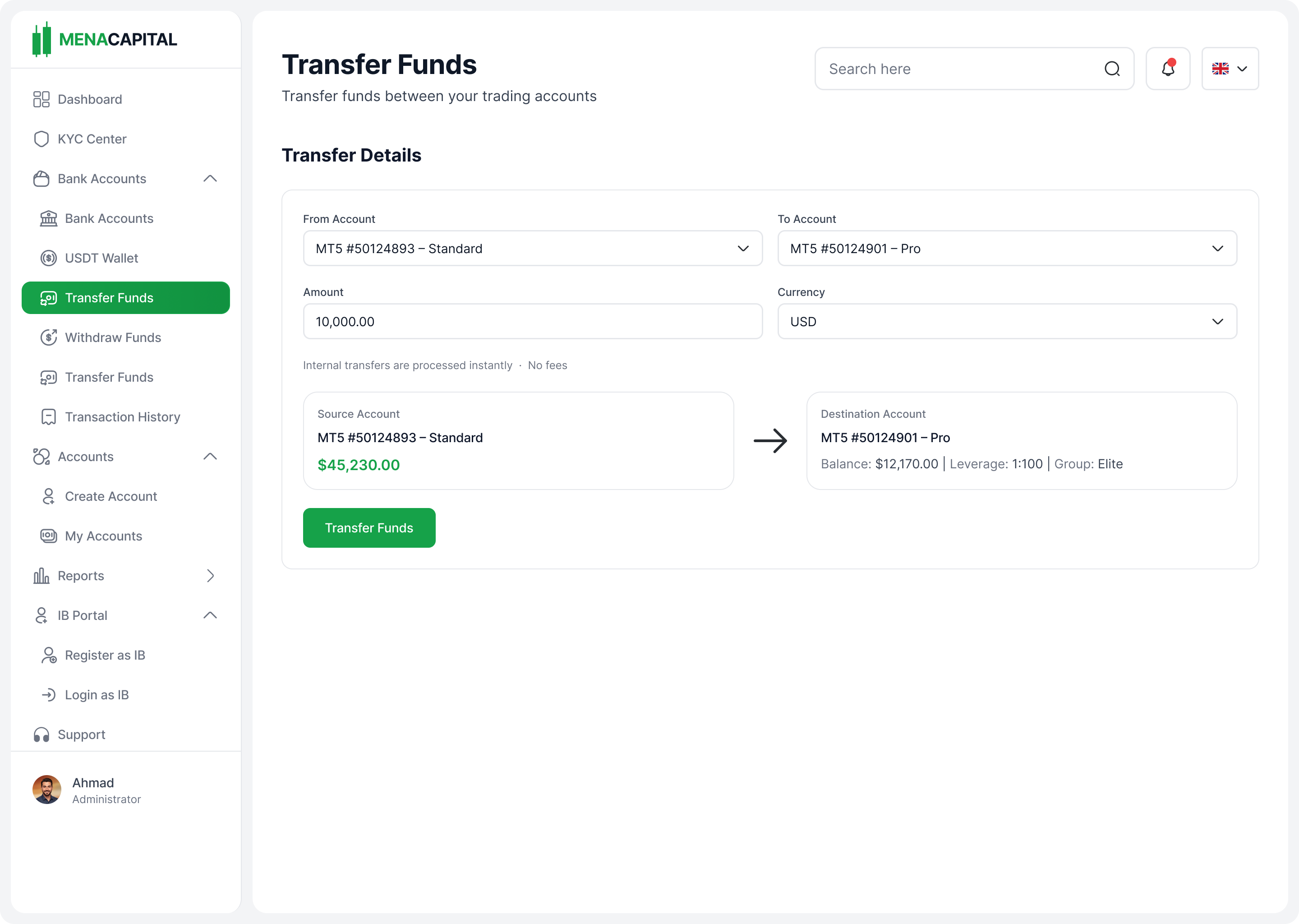
Transfer Funds: between accounts with confirmation
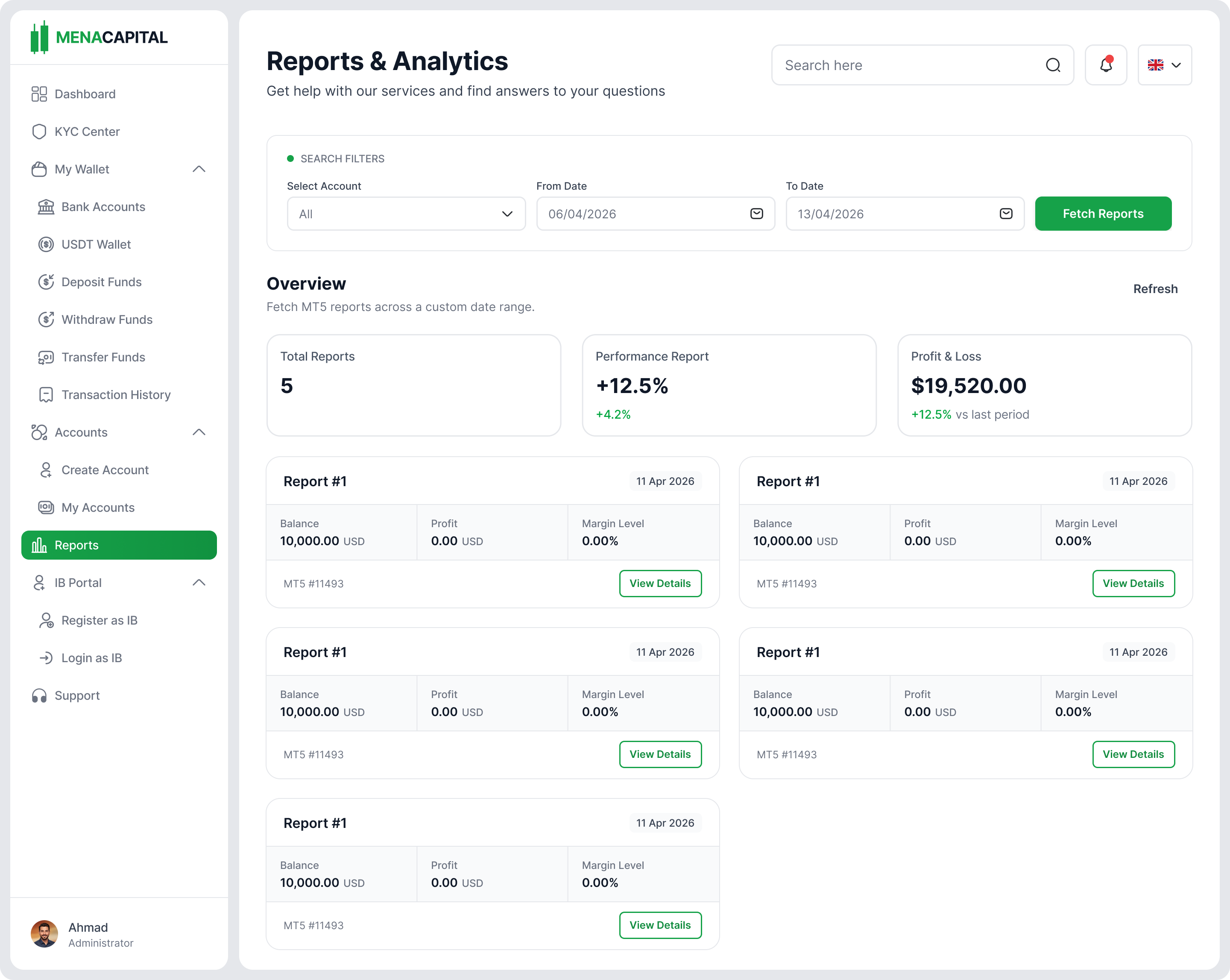
Reports & Analytics: portfolio performance at a glance
Design Decisions
Decision 01
Light mode as default, not dark
Stakeholders wanted a visually striking dark dashboard with gradients throughout. I pushed back. On a data-heavy platform, the priority is making stats easy to scan and read. I shared accessibility studies showing light interfaces outperform dark for information-dense views.
Decision 02
Invisible onboarding forms
Stakeholders wanted branded, decorative KYC forms. I presented a UX strategy brief with industry data showing visual complexity kills conversion, especially when users are entering sensitive financial data.
Decision 03
Intentional friction on every trade
Every irreversible action follows a preview → review → confirm pattern. One extra tap eliminates the "wait, did I just...?" panic.
Decision 04
Progressive disclosure over information density
Clean defaults that surface the critical 20% of data. Power users can expand panels and customise columns. One interface, two levels of depth.
Decision 05
Design system first, screens second
The team wanted screens fast. I prioritised building the foundation first: tokens, text styles, input fields, buttons, core patterns. Using Claude as a design system co-pilot, I rapidly generated and validated the entire token architecture before touching a single screen.
Validation & Outcome
I ran prototype usability tests with 6 participants across the three core flows (onboarding, deposits, and transfers) before engineering started building.
Rated "excellent" usability. Users described the interface as clean, trustworthy, and easy to navigate.
Users completed account creation, first deposit, and fund transfer without guidance or prompting.
Presented test results alongside the UX strategy brief. Founder approved light-mode direction and minimal onboarding approach on the spot.
Design system has held across 12+ screens in development. Engineers haven't needed a single token or component override.
Status
First modules are being built against my designs. This is an active engagement. I continue to ship new flows and evolve the system as the product grows.